Web Design · Design Systems
Eravue Agency: 0-to-1 Design Infrastructure
Eravue: Building A
Premium & Trustworthy
Digital Identity For
Modern Digital Agency
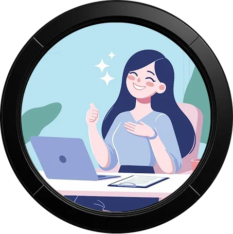
TL;DR — PROJECT SNAPSHOT
The 30-Second Summary
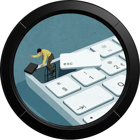
THE PROBLEM
Eravue was a new agency entering a saturated market with no digital presence. They needed to look established and trustworthy immediately to compete with legacy firms, avoiding the "amateur startup" look.
THE SOLUTION
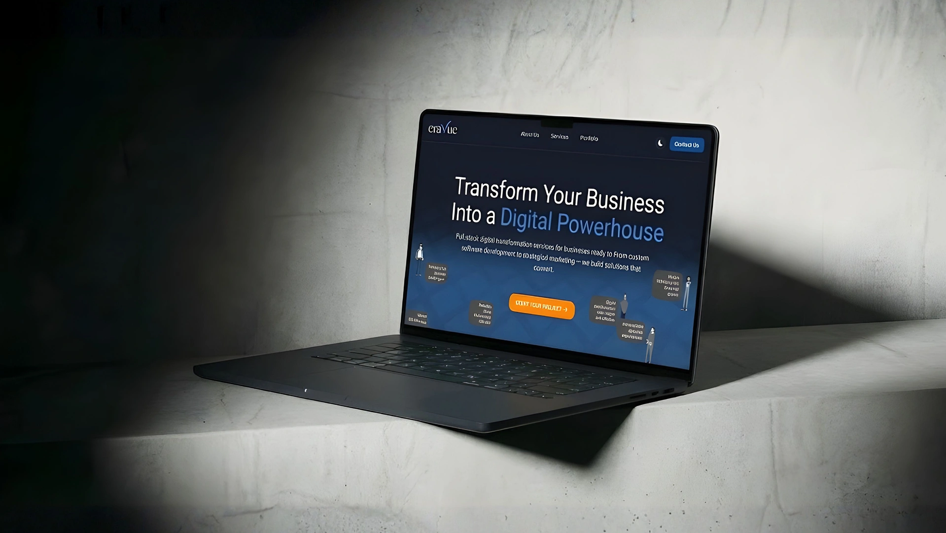
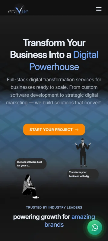
Eravue.com: A Dark-Mode First digital platform built on a scalable React architecture. It combines a premium aesthetic with conversion-focused UX to position the agency as a modern digital powerhouse.
MY ROLE
- • Founding UI/UX Designer
- • Visual & Brand Creative
- • Frontend Development (React)
- • Design System Architect
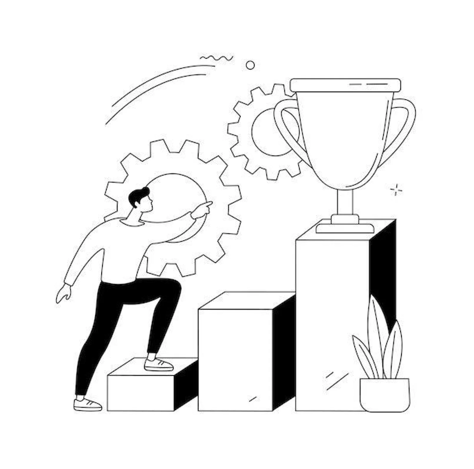
KEY OUTCOME
Delivered a comprehensive Brand Identity System and a high-performance website that generated qualified leads within the first week of launch.
CONTEXT
Eravue Brand &
Platform Launch
Eravue is a one-stop digital agency that helps businesses build their online presence — branding, UI/UX, website development and marketing, all in one place.
My role as the founding designer was to build the brand identity and website experience from the ground up, ensuring the platform immediately communicates trust, modernity and professionalism.
• Status: Live Project (https://eravue.com/)
PROBLEM STATEMENT
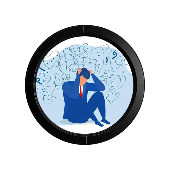
Digital growth isn’t the issue — digital overwhelm is.
Most businesses want to expand online but end up stuck in the process.
Many struggle with:
- Limited design and tech knowledge
- Inconsistent or outdated branding
- Difficulty communicating what they offer
- Overwhelming agency collaboration processes
Instead of enabling growth, the digital shift often creates confusion, delays and uncertainty.
CRAFTED SOLUTIONS
Eravue needed a Design Direction
Eravue needed a design direction that would reverse this experience —
one that:
- Builds trust instantly
- Looks premium and modern
- Communicates services clearly without jargon
- Makes businesses feel confident from the first interaction
OVERVIEW
Before We Proceed
The Team
4 Members (1 Designer, 2 Developers, 1 Marketing).
My Role
Founding UI/UX Designer (Responsible for Brand Identity, UI, UX, and QA).
Duration
4 Weeks (Concept to Live Project)
Tools
Figma, Adobe Illustrator, Click Up (Management), Astro/Typescript (Dev Handoff).
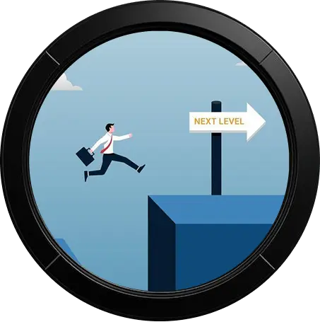
PROJECT GOALS
Design that sells — even before the first call
To support a strong launch and early client acquisition, the design needed to:
- Create a premium & trustworthy visual identity
- Communicate services clearly through a responsive website
- Maintain consistency across all digital touchpoints
- Enable outbound marketing immediately after launch
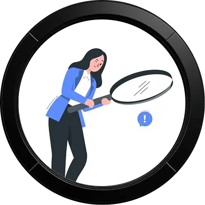
RESEARCH ANALYSIS
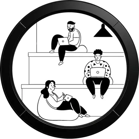
User Research: Target Audience
The platform is primarily for scaling their digital presence. They expect a polished visual identity, clarity without technical overload, and a single reliable partner for end-to-end digital growth.

Business Owners & Founders
Non-Technical Clients

SMEs
USER RESEARCH: PAIN POINTS
Understanding the mindset of businesses going digital
Instead of a long research cycle, we gathered insights through quick conversations with our target users planning to establish or upgrade their digital presence. From these discussions, four recurring pain points stood out:
Unsure where to start
Leads to inaction or delay in going digital
Outdated / inconsistent branding
Reduces credibility and trust online
Too much technical jargon
Users feel lost rather than supported
Multiple vendors for tasks
Causes miscommunication, delays & fragmented o/p
COMPETITIVE ANALYSIS
What We Observed
We reviewed 8–10 competing digital agency websites to identify patterns. We needed to keep what was working, but fix what was confusing clients.

Competitor Strengths (To Keep)
- Strong visuals and professional layouts
- Service offerings described in detail
- Consistent brand color and typography
The Strategic Gap
“Most agencies either look too technical or too generic.
There was a clear opportunity to stand out by being Premium + Modern + Approachable at the same time.”
What we saw (The Problem)
Why it fails (The Impact)
Buzzword-heavy descriptions
Unclear understanding of services
Long scrolling pages with dense text
Cognitive fatigue, low retention
Very corporate tone
Intimidating for non-technical clients
Generic visuals across brands
Difficult to build emotional connection
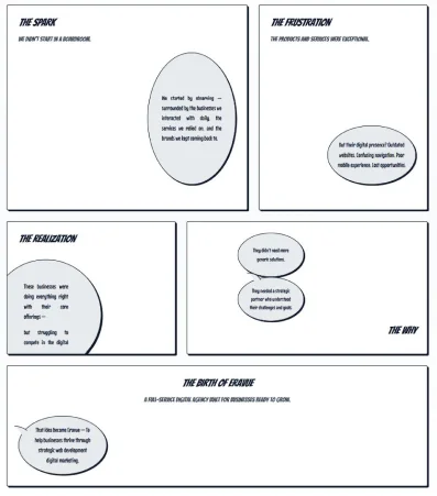
BRAINSTORMING & IDEATION
Exploring Design Directions
We explored different visual and UX directions with one core question in mind:
“Which experience will make clients feel confident and not overwhelmed?”
HIGH TECH / CORPORATE
- Feels Professional
- Intimidating for non-technical clients
CASUAL / FUN
- Friendly, Relatable
- Lacks Credibility, Premium Feel
PREMIUM / MODERN
- High Trust
- Hard to make memorable
PREMIUM + MODERN + APPROACHABLE
- Trust, Modern & Approachable
- Needs strong consistency
SKETCHES & WIREFRAMES
Some of the Iterations...
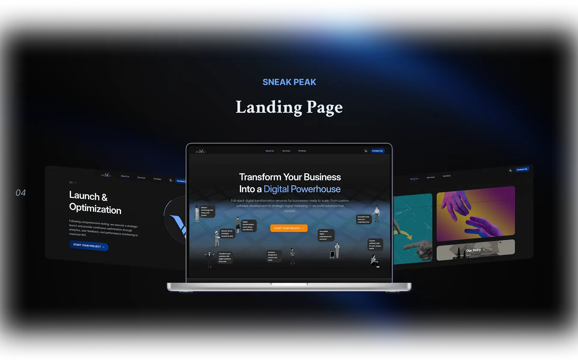
FINAL DESIGNS
User Flow
THE PROOF
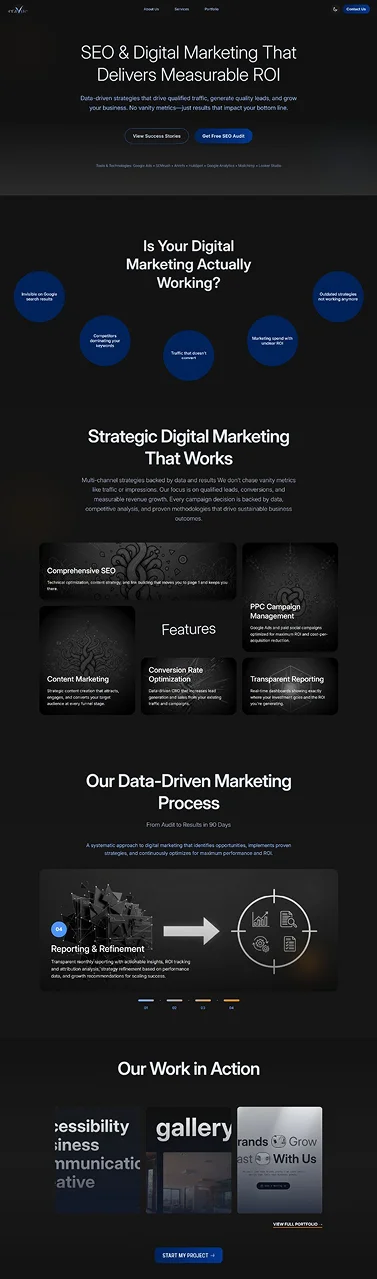
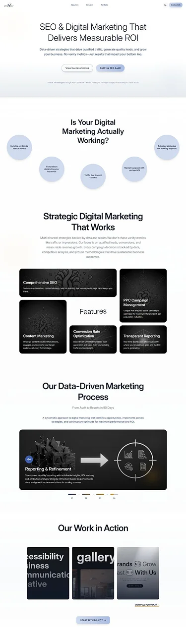
Full Page Experiences
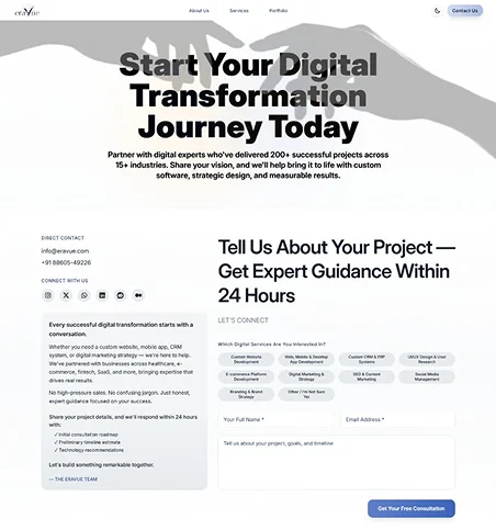
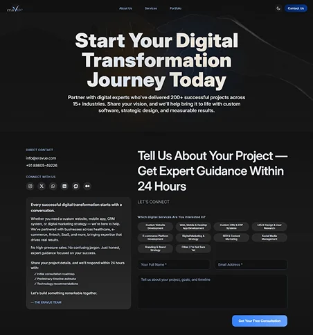
Hover over the designs to see them transform from Light Mode to Dark Mode.
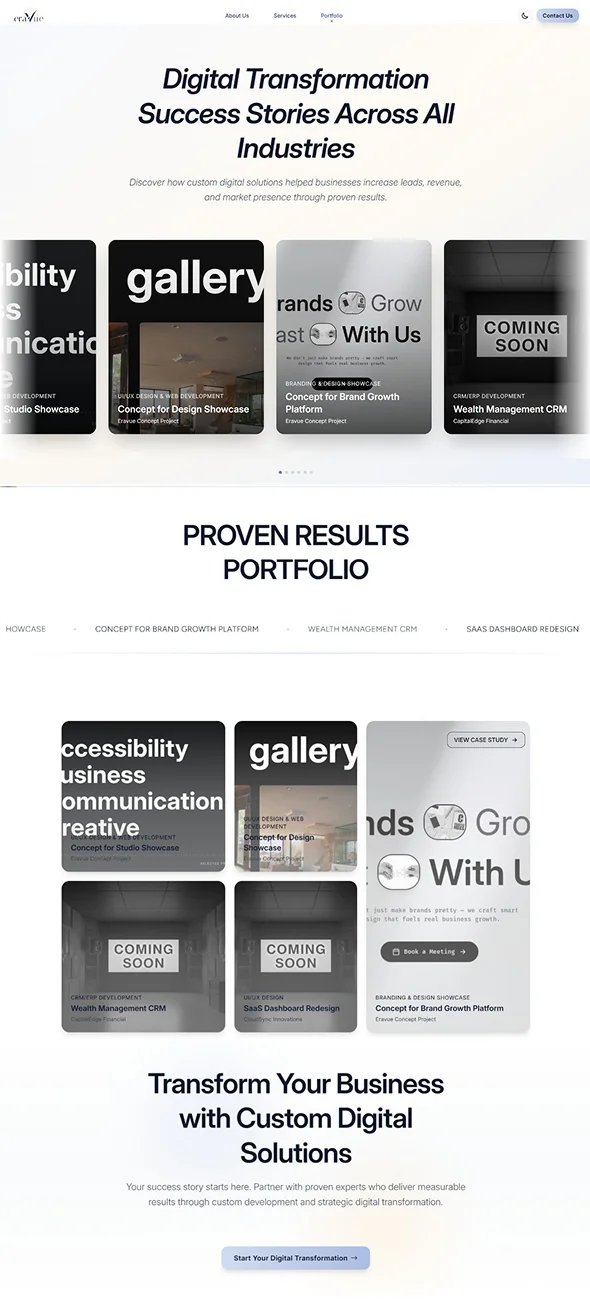
The Portfolio Page
Structured for scannability & impact
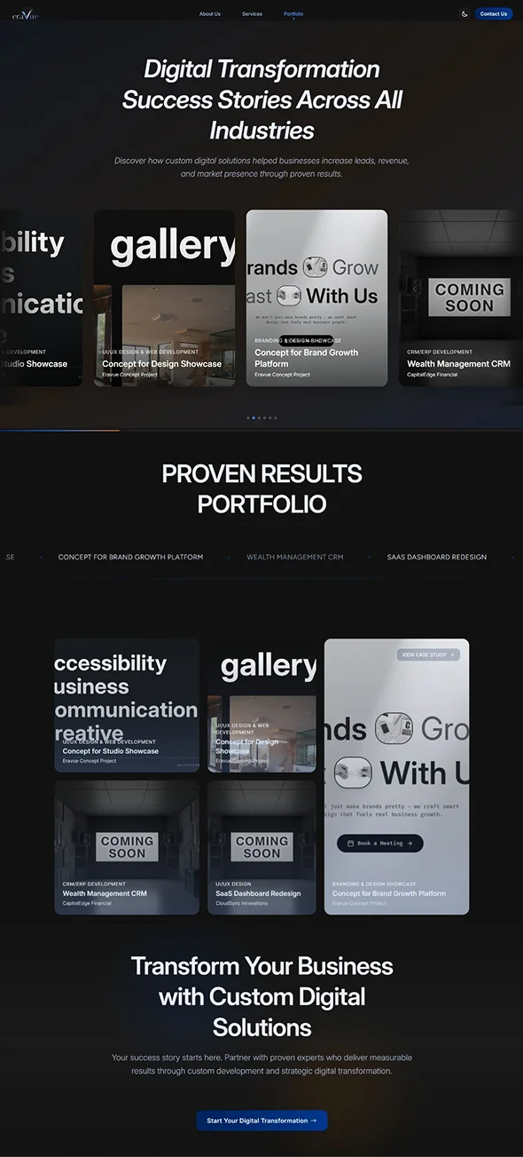
The Contact Page
Designed for conversion
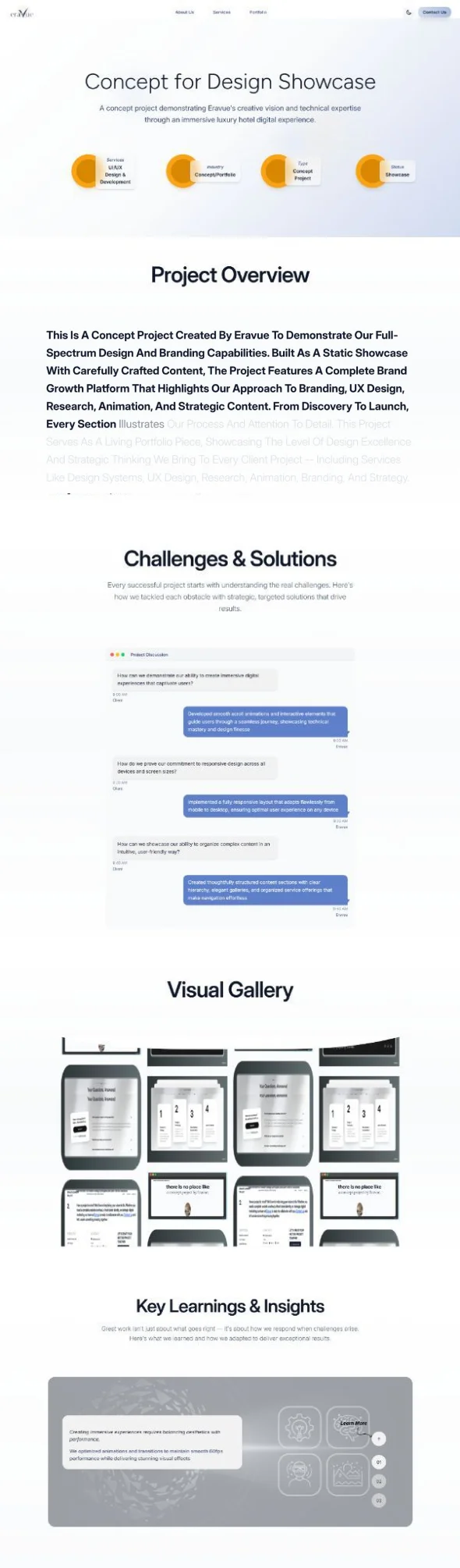
The Case Study Page
Immersive storytelling layout
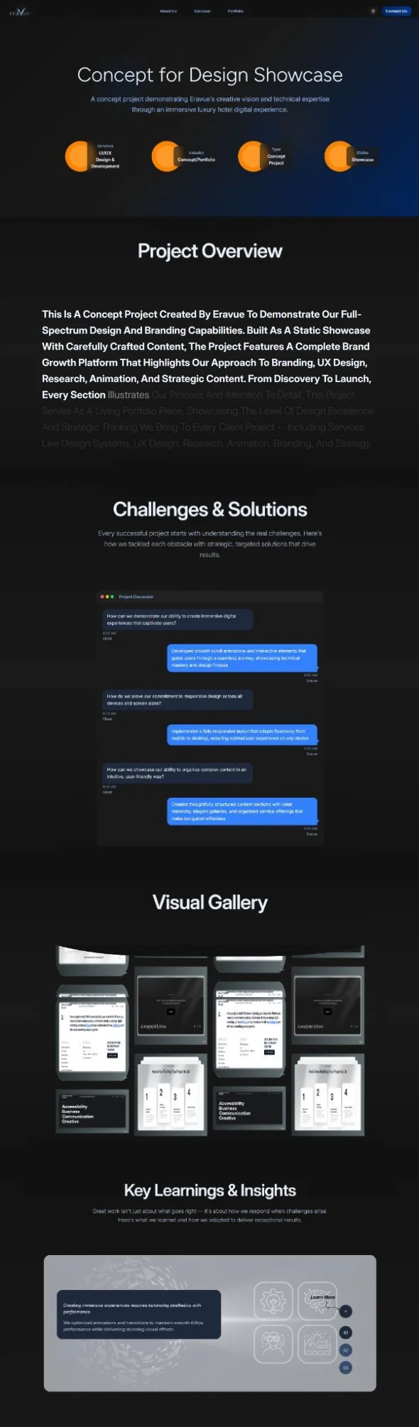
About Us Page
Clear mission, values crafted to improve client trust.
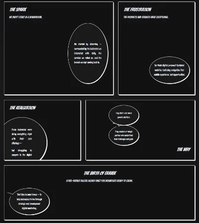
OUR STORY
Designed to build trust through clarity and structure — combining mission, values, and team into a clean, easy-to-scan layout.
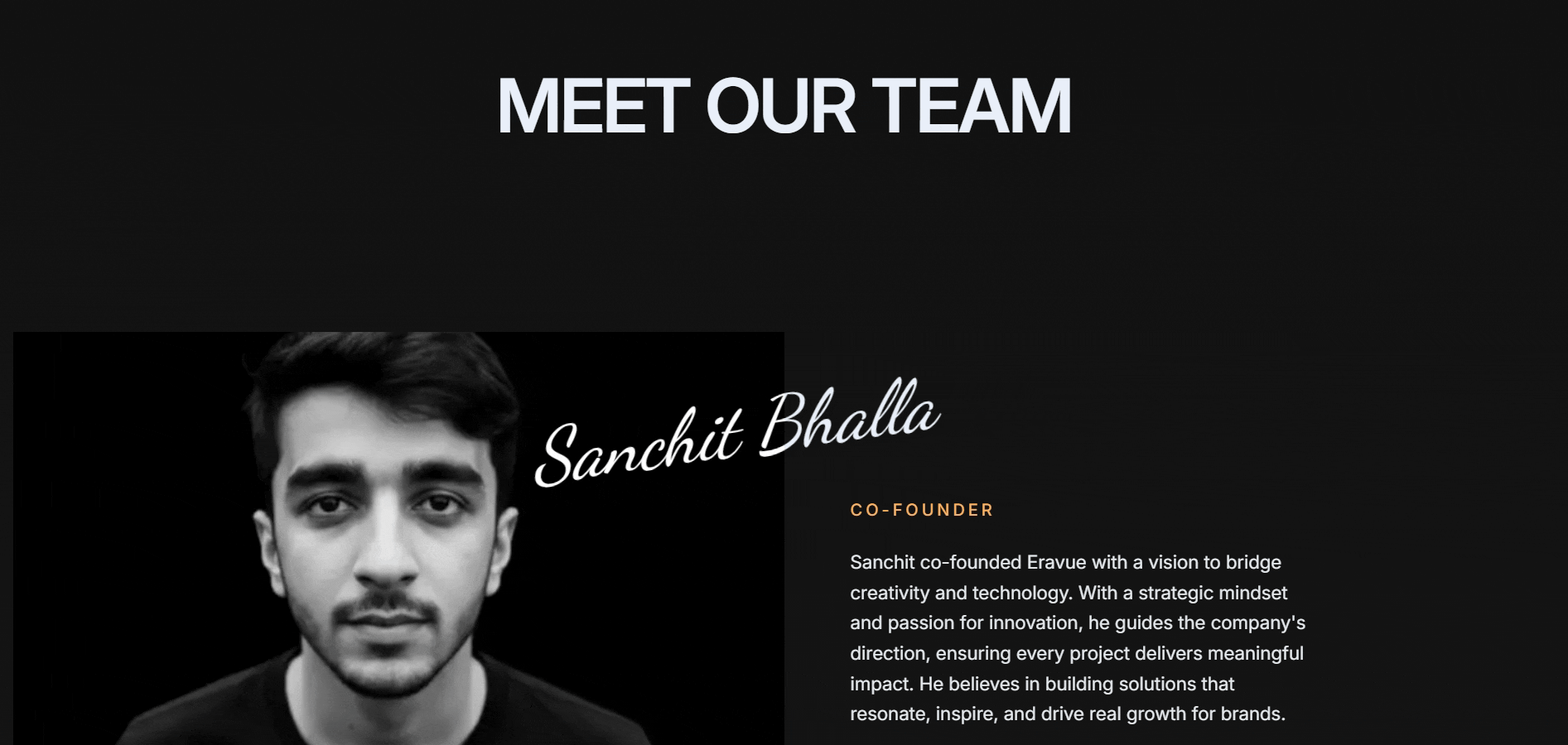
MEET OUR TEAM
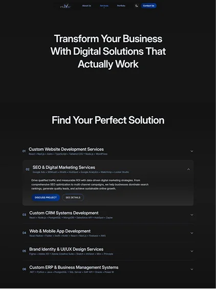
Services Overview
SERVICES PAGE
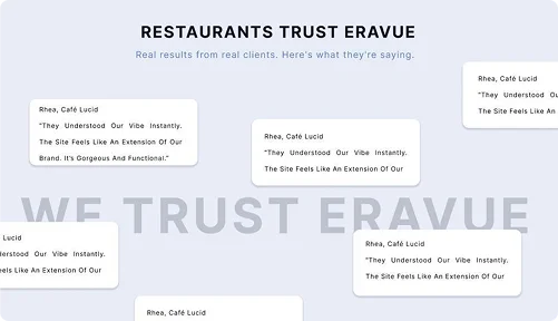
TESTIMONIALS
DETAILED SERVICES PAGE
FAQS
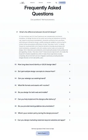
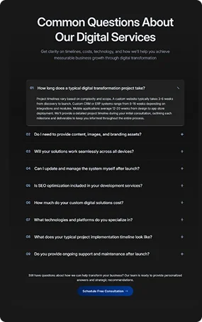
General & Service specific FAQs to simplify decision-making.
FOOTER
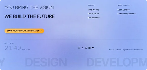
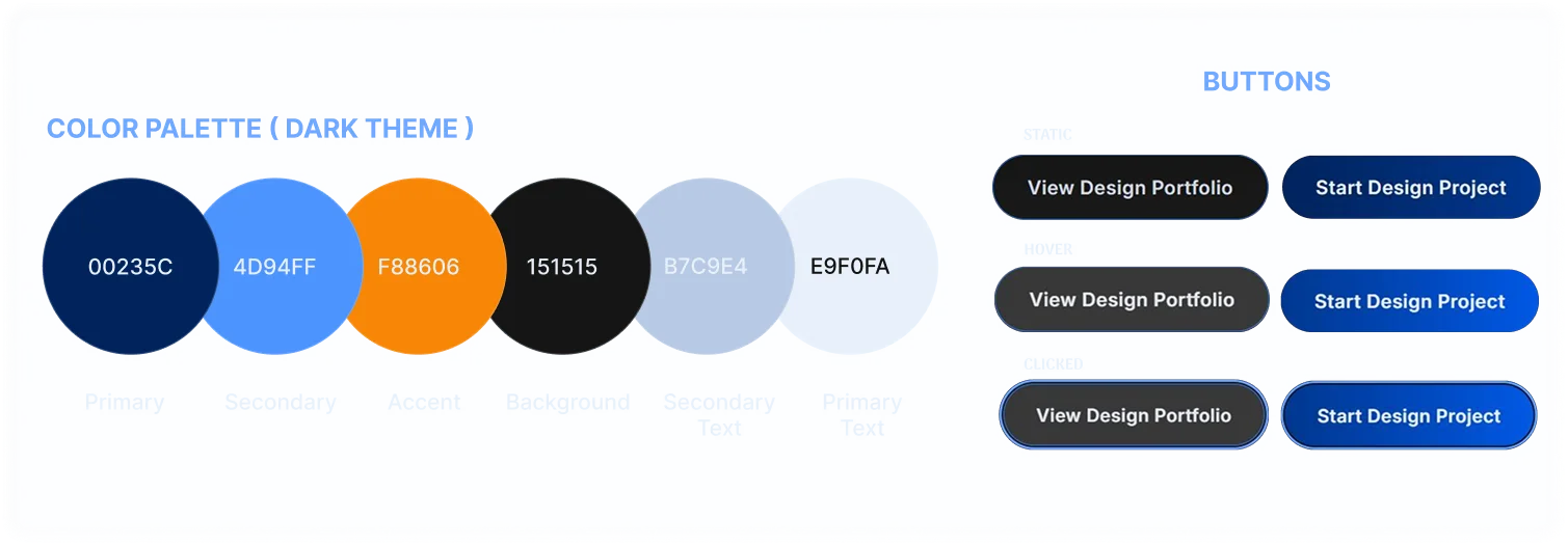
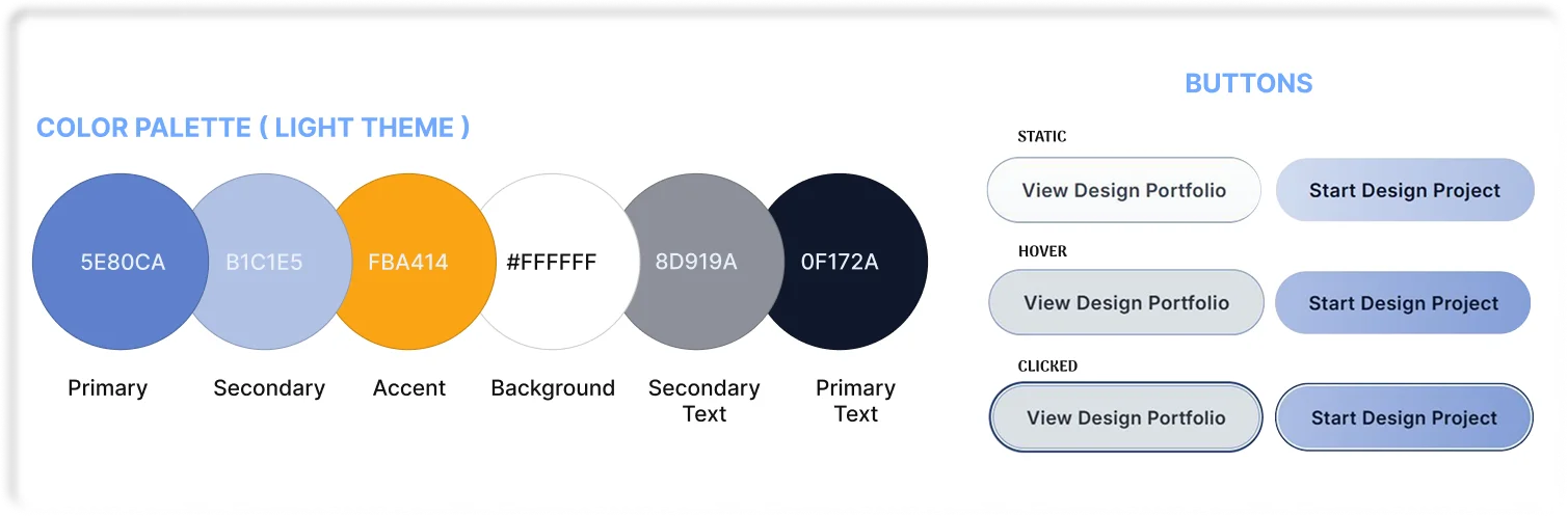
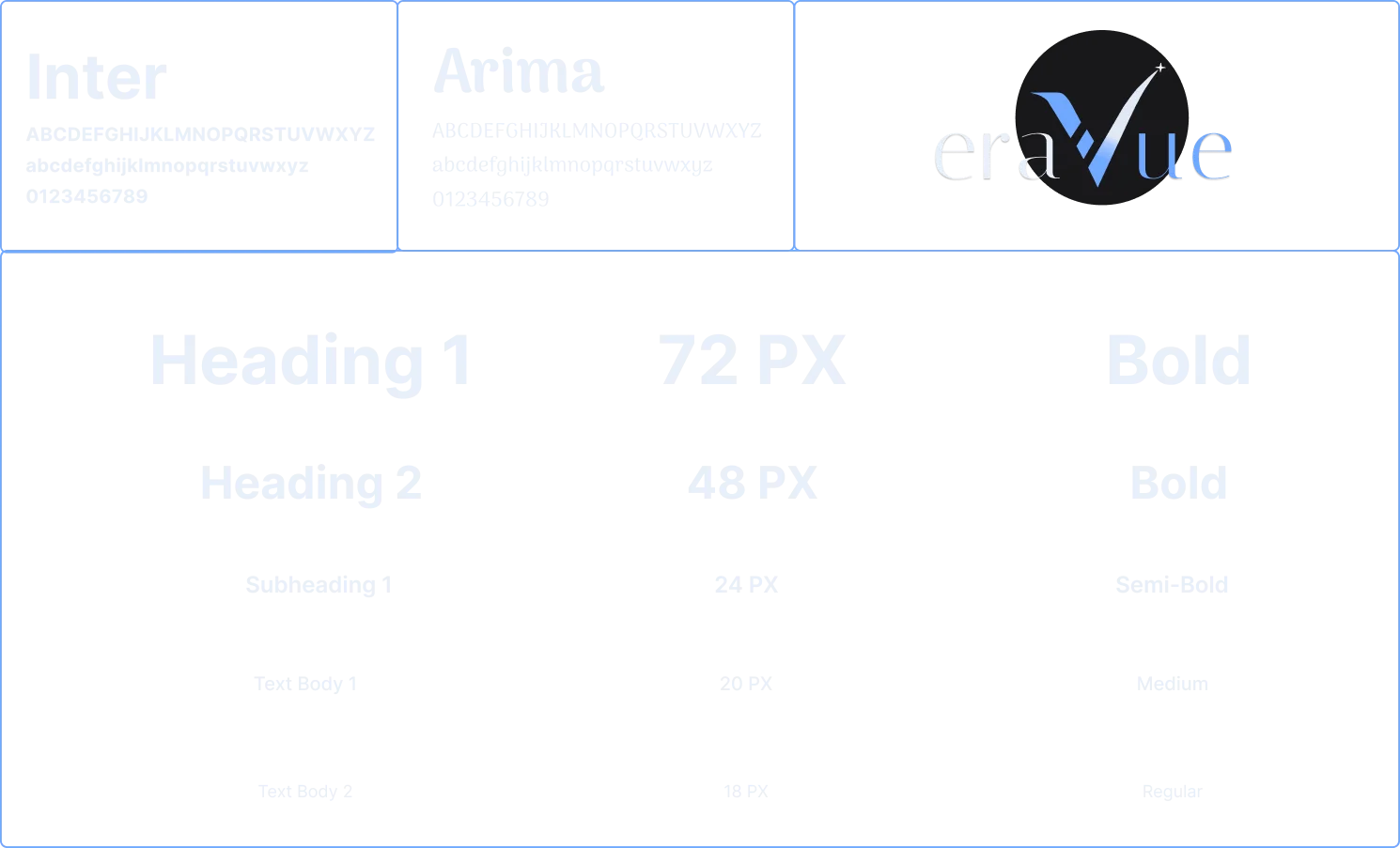
DESIGN SYSTEM & STYLE GUIDE
Building a Scalable Visual Language
We established a comprehensive design system to ensure consistency across the platform, defining clear rules for color, typography, and interactive components for both light and dark modes.
TYPOGRAPHY & LOGO
CONCLUSION
Impacts & Outcomes
The project delivered a modern, responsive, and trustworthy digital presence for Eravue—strengthening clarity, boosting early outreach, and establishing a scalable foundation for future growth.
KEY LEARNINGS
What This Project Taught Me.
This project helped me strengthen my ability to:
- Translate business goals into practical brand and UI decisions
- Maintain quality while working within a fast-paced, early-stage startup environment
- Use visual identity and structured content to improve trust and clarity
- Collaborate closely with developers to ensure scalable implementation
FUTURE SCOPE
What Could Have Been Done Better?
Stronger UX
Foundation
Better documentation, broader user input, and quick usability checks to guide decisions.
Platform
Growth
Add dashboards, onboarding, case studies, and an improved portfolio to expand functionality.
Design System
Development
Building a complete design system and style guide for consistency and faster iteration.
User Feedback
Loop
Use real user data post-launch to refine structure, content, and usability.